Climbing has been a big part of my life ever since Mark Fang first brought me to Mesa Rim in May 2015. Just over a year later, I completed my first boulder problem graded V6-V7. From then on, I began documenting my climbing accomplishments with the end-goal of being able to derive meaningful insights from my data. When I began my journey into data science, I knew I absolutely wanted to build a dashboard using my data, and I finally deployed the first version of this app around Thanksgiving 2019. Since then, I’ve updated the app several times, and with my recently newfound free time, I gave my app a complete make-over using a template for the main design.
Since I’m pretty happy with the current state of my project, in this blog post, I want to discuss some of the work and my thoughts that went into developing it.
Please check out the app here. (Note: It may take a few seconds for the website to come out of a sleeping state.)
Collecting the Data
In May 2015, I was a wet-lab biologist working with small data and did not have any concepts of modern tech. For example, I did NOT know about relational databases, table joins, and I definitely did not know about SQL. Therefore, I recorded the data in an Excel spreadsheet, and my priority was ease of data entry. It took me seconds to add a new row manually, and it worked well for my purposes. Here is a sample of the first three rows:
| date | description | wall_type | grade | setter | location |
|---|---|---|---|---|---|
| 2016-06-13 | Pink crimps | overhang | V6-V7 | Enrico | Mesa Rim Mira Mesa |
| 2016-06-19 | Purple crimps, easy | face | V6-V7 | Casey | Mesa Rim Mission Valley |
| 2016-07-08 | White sloper, easy transition out of sloper | face | V6-V7 | Casey | Mesa Rim Mission Valley |
In addition to this data, I also have videos of most of these climbs. With the date and description, it was easy for me to find the corresponding video on my hard drive or Instagram. In the beginning, I never anticipated collecting hundreds of rows of data, and indeed, I stopped collecting data on certain grades after I felt they became less of an accomplishment. For example, I stopped collecting data on most indoor V7’s after I completed 50 of them. Therefore, my dataset is inherently biased, because data only exists where I thought a particular climb was worth recording.
Visualizing the Data
The first graphs I made using this data were using Excel and Graphpad, in which I plotted the following:
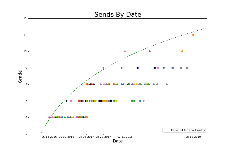
- First of a grade on the y-axis, date on the x-axis, with a regression curve running through these points to predict the approximate date when I would accomplish the first of the next grade.
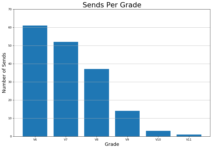
- Total number of climbs per grade on the y-axis, date on the x-axis (eg. number of V7s over time), with a linear regression line whose slope is the average number per day
- Number of climbs per week on a rolling average (ie. the first derivative of above)
Graph 1 can be found on this Instagram post, and graphs 2-3 can be found on this Instagram post. These figures provided me with invaluable feedback, because they suggested if I keep doing what I was doing, I will keep getting what I was getting. My main KPI was climbs per week, with a soft goal of leveling up, and I tried to keep up my rate of one V7 per week.
After learning Python, I used matplotlib to programmatically bring to life what I had previously made using Excel and Graphpad. After experimenting with different plot types, I realized that I would rather look at a few figures that contained a lot of information rather than a lot of figures that contained more-specific information. Therefore, I settled on the following figures:
While these are great for examining past progress and trends, there are a range of free cell-phone apps, including the now popular Kaya app, that can accomplish the same thing. Plus, this would only be a meaningful data science project if it can insight beyond merely providing a visualization of the record.
Capturing the Data
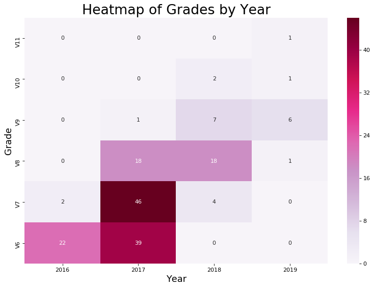
To derive further insights, my first instinct was to think about other dimensions of climbing. I was already collecting information on wall-type, so I went ahead and made a heatmap and histogram of grade by wall-type.
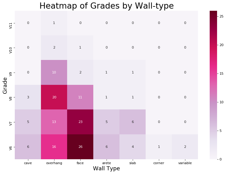
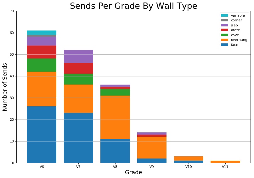
These visualizations provided me with more insight, because they quantitatively confirmed my suspicions that I did a lot of face climbs and overhangs and not as much cave, arete, slab, and corners. They also provided the additional information that harder climbs I did tend to be face climbs and overhangs. This is okay, because the bias was introduced naturally, not artificially. For example, it is relatively difficult to find V10 slab at the gym. As a data scientist, I believe it is of utmost importance to understand any biases in the data. Because data science doesn’t just begin at the analysis and interpretation of existing data, it starts at data collection. You can only analyze data that has already been collected, and that data must be a meaningful representation of the event and also capture the event in such a way that it lends itself to quantitative analysis. In other words, your analyses will only ever be as good as your data. What this means in industry is you should always ask yourself:
- Did I capture all of the data?
- If not, is it because of my query or because of the dataset?
- If it is because of the dataset, what other metrics do I need to collect?
With these questions in mind, it was clear that there was more information to be captured. From the perspective of most climbers, climbing grades are subjective. However, having been trained in science, I always suspected there must be some kind of quantitative truth underlying the subjectivity of climbing grades. Experienced climbers know that there are four main ways to make a climb harder:
- make the climb steeper
- make the holds worse
- make the moves bigger
- make the moves require more accuracy
The wall-type labels sufficiently capture information on the first item. Although having categories such as face and overhang might not give as much resolution as a specific wall-angle, eg. 30 degrees vs. 35 degrees, I believe this is the right level of data for this project.
To capture information about the moves, I added style labels for each climb, distinguishing them as having one of the following four styles: natural, comp, dyno, and mantle. Natural climbs are similar to what you would find in the outdoors and can be climbed with standard techniques. Comp is short for competition climbing, and these climbs highlight more parkour-like tricks that you would normally not do on outdoor rock. I also included dyno and mantle as categories, because sometimes the purpose of the climb is to do that one move (eg. see Rainbow Rocket).
Capturing hold information was the trickiest, because many climbs contain multiple hold-types, many of which are equally important. For example, it’s not fair to say that a climb with mostly crimps and one sloper is a crimp climb, especially if moving past the sloper is the most difficult part of the climb. To store this data, I had to decide between two options with a trade-off between best-practices and usability.
Option 1: Normalized and atomic
| date | description | crimp | sloper | jug | pinch |
|---|---|---|---|---|---|
| 2016-12-11 | Discount Dyno | True | True | False | False |
| 2016-12-11 | Unnamed on Discount Dyno | True | True | False | False |
| 2016-12-11 | Turnbuckle | True | False | False | False |
The benefit of this is no preprocessing needs to take place before calculating any aggregate statistics. The downside is that it requires us to have pre-defined hold types as columns, and adding extra columns would be difficult. Furthermore, this form reduces readability, especially if I were to also convert wall-type and style to this format.
Option 2: Comma-separated string
| date | description | hold_type |
|---|---|---|
| 2016-12-11 | Discount Dyno | crimp, sloper |
| 2016-12-11 | Unnamed on Discount Dyno | crimp, sloper |
| 2016-12-11 | Turnbuckle | crimp |
The benefit of this is that the data is all kept together and is easy to read. If I wanted to add extra hold-types that I didn’t add before (like pocket, undercling, or custom), it would be very easy to do so. The downside is that CSV rows must be unnested before counting.
After weighing the pros and cons, I decided to use the comma-separated list to store this information so that I can remain flexible. Even though this was not standard practice, it fit the requirements of my project, and in the unlikely event that I would want to scale up to multiple users, I can always switch back to Option 1, normalize my database, and store the different permutations in a separate table, as in the following example:
Table 1: boulder
| user | climb_id | date | description | hold_type_id |
|---|---|---|---|---|
| 1 | 1 | 2016-12-11 | Discount Dyno | 3 |
| 1 | 2 | 2016-12-11 | Unnamed on Discount Dyno | 3 |
| 1 | 3 | 2016-12-11 | Turnbuckle | 4 |
Table 2: hold_type
| id | crimp | sloper | jug | pinch |
|---|---|---|---|---|
| 1 | True | True | True | True |
| 2 | True | True | True | False |
| 3 | True | True | False | False |
| 4 | True | False | False | False |
With the three dimensions of climbing, I feel that I’ve captured as much information about the climb as I can as a human being. However, it’s fun to imagine what you could do with a 3D model of a climb, for example, with the kind of data collected by Climb Assist. To completely and quantitatively capture the information about a climb, here are some ideas:
- size (depth, length, width) of each hold (handholds and footholds considered separately)
- texture of the hold (coefficient of friction?)
- distance between holds (min, max, average, median)
- precision required (probability of each move based on physical constraints, eg. size of pocket vs. total size of hold, may require testing)
- amount of force required to hold a position (would require a model)
- minimum amount of energy expended to execute the climb (would require a model)
The V-grade is a function of these physical attributes. However, note that it’s highly impractical to collect all this data on every climb that you do. Maybe some day computer vision will make computing these parameters quick and easy, but since we’re far from that point, having low resolution categorical information about each climb is good enough for my purposes.
Building the App
To host my app on the web, I chose to use Flask to build a web app, because I found that it to be easy to set up and works well on Heroku. The first version of my app merely hosted images, but since my goal was to make this app fully automated, I built the back-end to take the data from PostgreSQL database (or CSV file as a backup), do some basic data transformations, and output relevant figures. These are all industry-relevant skills. For example, in both of my last two industry positions, we were using Flask apps for data visualization and ETL.
Modularizing the Code
One of the things that motivated me to modularize my code is that I was impressed with Plotly’s sleek, modern feel. As you’ve probably seen on the app (eg, on this page), Plotly figures are interactive. You can zoom into different regions and hover over the points to see additional text. Hence, I wanted to replace all of the matplotlib figures with Plotly figures. For example, compare the following two figures. Which one looks better?
In the first version of my app, my code was highly case-specific, which made it a relatively small program, but made an update like this one a lot of work! Therefore, I had to refactor the code, and only after the code was sufficiently modular was I able to comfortably swap out the old code without having to worry about dependent functions breaking.
Doing the work of refactoring my code-base reinforced the idea that in coding projects, design patterns matter the most, followed by variable and function names and consistent syntax. Having modular code enables debugging, scalability, and most importantly, maintainability. As an example, to swap out the code for plotting a scatterplot, all I had to do is to prove to myself that the following code is equivalent by way of a unit-test.
def plot_scatter(df, x, y, color=None,
                 xlabel=None, ylabel=None, title=None,
                 jitter=True, figsize=(8, 5)):
    """Generic matplotlib plotting function"""

    if jitter:
        df[y] = df[y].apply(lambda num: num - 0.15 + 0.3 * random.random())  # Jitter

    fig = plt.figure(figsize=figsize)
    plt.scatter(df[x], df[y], color=color)

    if xlabel is None:
        xlabel = x
    if ylabel is None:
        ylabel = y

    ax = fig.gca()
    ax.set_xlabel(xlabel, fontsize=16)
    ax.set_ylabel(ylabel, fontsize=16)
    ax.set_title(title, fontsize=18)

    return fig
def plot_scatter(df, x, y, color=None,
                 xlabel=None, ylabel=None, title=None,
                 jitter=True, layout=True
                 hovertext=None, hovertemplate=None):
    """Generic plotly plotting function"""

    if jitter:
        df[y] = df[y].apply(lambda num: num - 0.15 + 0.3 * random.random())  # Jitter

    fig = go.Figure()

    scatter = go.Scatter(x=df[x],
                         y=df[y],
                         mode='markers',
                         marker={'color': df[color]} if color else None,
                         text=hovertext,
                         hovertemplate=hovertemplate)

    fig.add_trace(scatter)

    if layout:
        fig.layout.update(
            title=go.layout.Title(text=title),
            xaxis={'title_text': xlabel,
                   'showgrid': True,
                   'range': None},
            yaxis={'title_text': ylabel,
                   'showgrid': True, 'gridcolor': '#E4EAF2', 'zeroline': False,
                   'range': [df[y].min() - 0.5, df[y].max() + 0.5]},
            plot_bgcolor='rgba(0,0,0,0)',
            showlegend=False,
            hovermode='closest'
        )

    return fig
In industry, I was told often and loudly that Jupyter notebooks are not maintainable. However, I believe that the problem isn’t with the Jupyter notebooks themselves, but that Jupyter notebooks make it easy for people to write code that is not maintainable. For example, I often saw entire EDA projects on single notebooks, from data processing to figures being generated on the fly, back to more data processing and a final data export at the end. I also saw people naming their dataframes df1 and df2 instead of things like customers_table and orders_table. While writing code like this can certainly generate the answers that stakeholders seek, bad practices will lead to getting off the merry-go-round at the same point as you got on: with analyses that start from scratch. Only by having good practices can you continue to build off prior work.
Outro
In summary, beyond the practical aspects of just “analyzing data,” there are many design choices that go into every data science project:
- What figure-types best show the effects captured by the data?
- How modular should the codebase be?
- Did I capture all the information? Did I store the information in a way that can scale up?
- Should I care about the presentation of the final product? What website template should I use? What plotting libraries should I use?
This project is very personal to me and is also my longest-standing project. Creating and maintaining this project has been fun, frustrating, and satisfying all at the same time. If you look at this project from the vantage point of the completed product, you may be tempted to think “duh, of course these are the metrics you should collect”, or “duh, of course these are the figures you should display.” But if there’s one message I hope to impart, it’s that keeping an open mind is the basis of creativity.
If you’re interested in how the app was built, please be sure to check out the Github repository here, and happy data sciencing!