In San Francisco and other major cities in the United States, the cost of rent and the number of renters are both continually increasing at a steady pace. With the worsening of the housing crisis, San Francisco offers a mechanism through the SF Rent Board in order to mediate disputes between tenant and landlord for items such as capital improvement requests or wrongful evictions.
Being able to predict the volume of rent petitions could be useful, since if you are a landlord or tenant, this feature will be informative of the turnaround time for processing requests, or if you are in a more niche business and need to predict the number of capital improvement requests or housing prices, then the number of rent petitions could be an important feature in your machine learning model.
Data Acquisition
In addition to the Petitions to the Rent Board dataset, I downloaded data on the Unemployment Rate in San Francisco County from the Federal Reserve Bank of St. Louis.
Data Cleaning
Although the data is freely available, there was still some work that went into the cleaning process. The main sources of error in the data were unusable zip codes, incorrect neighborhood assignments for given zip codes, and duplicate entries.
Duplicate entries are when single addresses submit multiple petitions on the same day. For example, on April 30th, 2015, a property at 600 Block of Commercial Street submitted 78 petitions. I merged such entries into single rows and kept track of the number of occurrences and the unique petition IDs, just in case I needed to access them in future work.
Grouping Counts by Date
Since I was interested in the count and not any of the individual features, I used the groupby function to generate some preliminary count plots of the data for all of SF. To check how different group sizes affected the signal-to-noise ratio of the data, I grouped by days, weeks, months, and years. The following plot below shows the difference between the groupings.
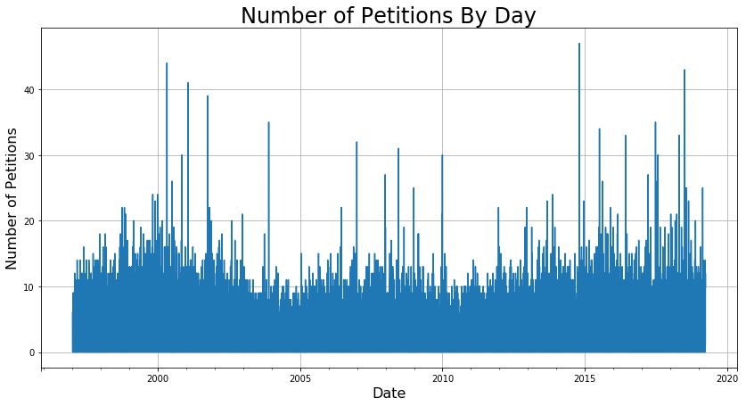
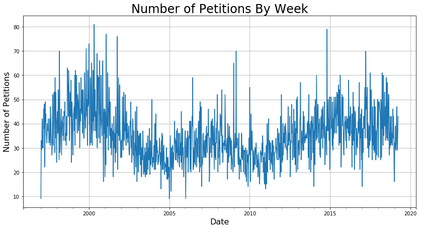
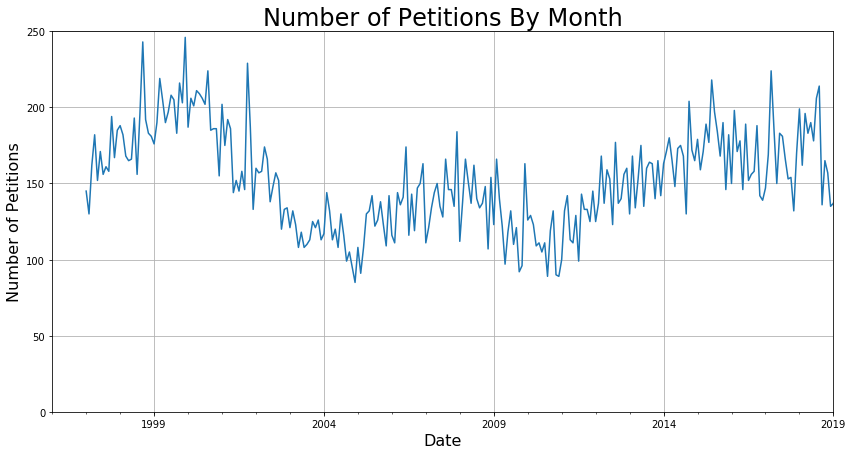
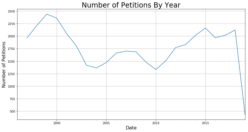
I found that grouping by month had the right balance between signal and noise that would work well for modeling. While it would be great to get a daily prediction, the fact is like with any statistical task, that when zoomed in too far, the modeling breaks down. For example, it is near impossible to predict the exact timing of each person entering and exiting Starbucks, but it is relatively easy to predict how many will enter within the range of an hour.
Grouping Counts by Neighborhood
The following is a Tableau plot of the 40 neighborhood groupings provided in the dataset.
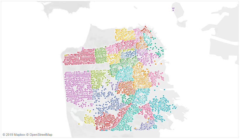
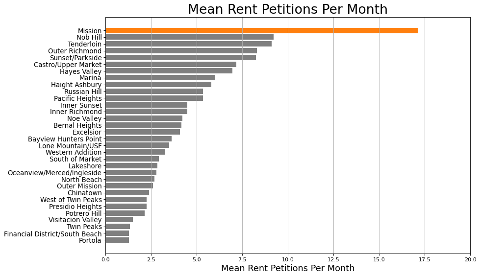
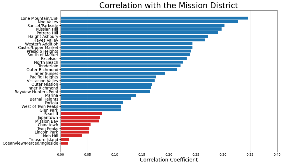
Since the block addresses and neighborhoods for all entries are provided in the dataset, I wanted to see if certain neighborhoods produce more rent petitions than others. This is a reasonable guess, since the Mission District is well known for activism surrounding renters’ rights; presumably the Mission District contributes more to the overall trend than do other neighborhoods. The following bar plot shows that, as expected, the Mission District produces double or more of the number of rent petitions per month of any other neighborhood.
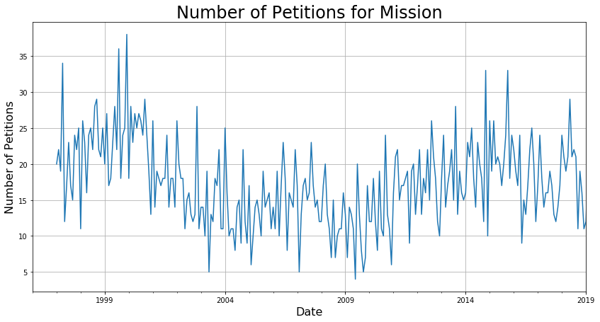
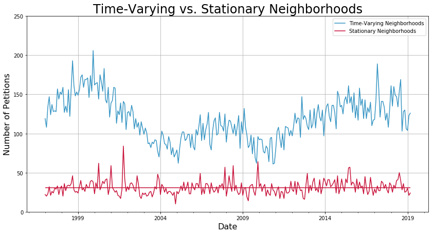
The following figure shows that the trend for the Mission District is very similar as the trend for all of San Francisco. From now on, I will call neighborhoods with significant trend as time-varying.
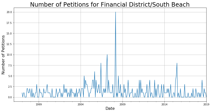
Just as an example, the following is a neighborhood that does not vary much over time; I labeled neighborhoods like this one as stationary.
Since the Mission District is a main component of the overall trend, I found that the correlation with the Mission District could be used to group together neighborhoods that are time-varying. In the following bar plot, I labeled any neighborhoods that had significant correlation with the mission district as blue.
After collecting the neighborhoods in these two groups, I replotted the data and found that indeed, I had separated out the neighborhoods that had no trend.
Let’s see what this looks like from a geographic standpoint.
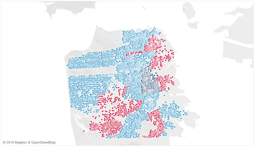
As expected, the neighborhoods that are stationary are in the sections of the city where renting is relatively rare due to the abundance of businesses and lack of homes. With the neighborhoods reasonably clustered, I am ready to begin forecasting. The technique of time-series analysis is the final component of my Data Science portfolio, which I presented on Career Day at Metis, San Francisco.
Data Preparation
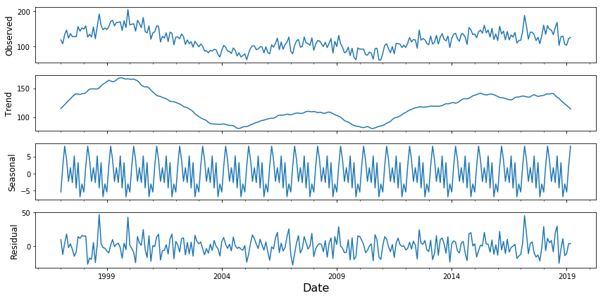
For the neighborhoods that are grouped as time-varying, first, I used statsmodel’s seasonal decomposition function to remove the seasonal component, so that I’m only dealing with the trend and residual.
petition_decomp = seasonal_decompose(petition_counts_by_neighborhood_df[seasonal_neighborhoods_list].sum(axis=1), model='additive', extrapolate_trend = True)
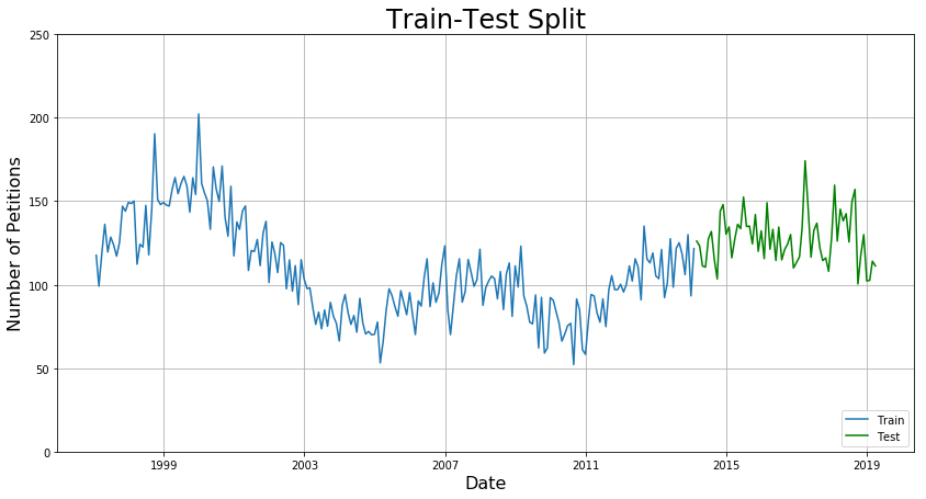
Second, I set aside some data for the test set that will remain untouched while training the model. I found that 20% of the data occurs after January 1, 2014, so I split the dataset into a training set of data prior to this date and a test set of data after this date.
Forecasting Using SARIMA
SARIMA is an industry standard for doing time-series analysis. SARIMA stands for Seasonal Auto-Regressive Moving Average, which is a mouthful! Rather than divert this blog post to explain the underlying math, I refer you to this tutorial by Kostas Hatalis, which I think is an excellent resource. It explains what SARIMA is and provides some good rules-of-thumb on how to pick the correct parameters. For a more detailed explanation on ARIMA models in general, I recommend Chapter 3 of Shumway and Stoffer, which is freely available for download.
From the modeling perspective, SARIMA has seven components, typically written as follows:
SARIMA(p,d,q)(P,D,Q)[s]
where each of the components p, d, q, P, D, Q, and s are integers describing different parts of the equation. The success of the SARIMA model will depend on picking the correct parameters. The best model will give the lowest mean average error for the test set.
Let’s use SARIMA to forecast the trend and the residual. To pick out initial parameters to try, we need to look at the autocorrelation function (ACF) and partial autocorrelation function (PACF), given below.
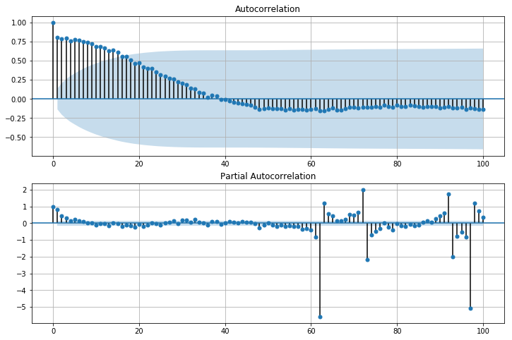
In the plot above, the shaded blue area represents the significance level. Anything outside of the shaded blue is significant.
Looking at the ACF on the top, we can deduce the following:
- q = 1, the first significant lag
- s = 15, the highest significant lag
- D = 1, because the seasonal pattern has been removed using seasonal decomposition
- d = 0, because the series has no visible trend whatsoever.
Finally, looking at the PACF on the bottom, we can deduce that p = 1, the first significant lag.
Collecting the results, this means that the first model to try is
SARIMA(1, 0, 1)(P, 1, Q)[15]
where I search over the space P+Q≤2 and pick the best one. I found that P=2 and Q=0 gives the best results.
mod = sm.tsa.statespace.SARIMAX(petition_train_df[['Datetime', 'Adj. Signal']].set_index("Datetime"),
                                order=(1, 0, 1),
                                seasonal_order=(2, 1, 0, 15),
                                enforce_stationarity=False,
                                enforce_invertibility=False,
                               freq = 'M')
results = mod.fit()
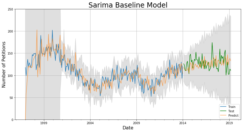
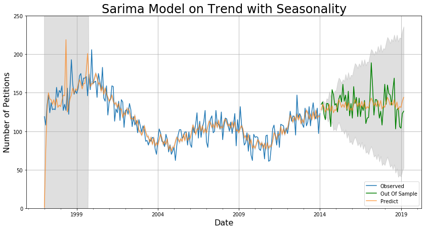
The mean absolute error (MAE) are 4.9 for 3 months, 11.4 for 1 year, and 14.8 for 5 years. This is pretty good, and another short grid-search on the parameters p, q, and s reveals that this is indeed the best model. However, for SARIMA models in general, it’s pretty apparent from the graph that even though the MAE is low, the predictions are lagging behind the actual data. Furthermore, the 95% confidence interval is pretty large.
How can we fix these issues?
One way is to model on the trend alone, and then add back in the seasonal component. Using this approach, we will not be able to add back the residual, but if we can get rid of the lag, maybe this is okay.
Like the approach above, I generated the ACF and PACF for the trend.
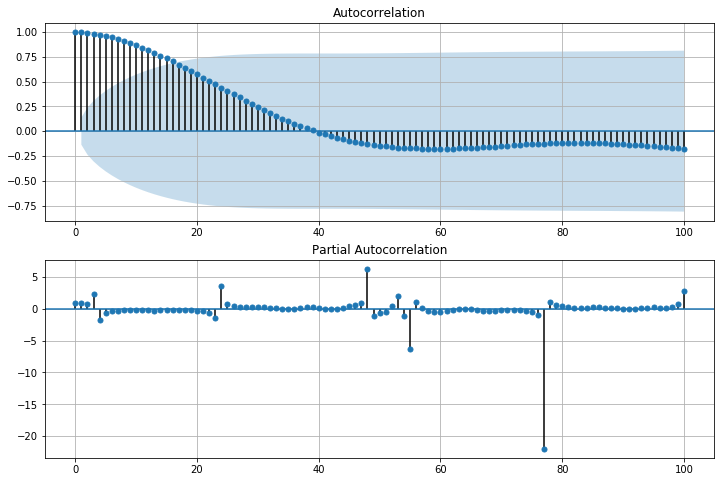
Looking at the ACF on the top, we can deduce the following:
- q = 1, the first significant lag
- s = 16, the highest significant lag (different from above)
- D = 1, because the seasonal pattern has been removed using seasonal decomposition
- d = 0, because the series has no visible trend whatsoever.
Finally, looking at the PACF on the bottom, we see that the first significant lag is at 3 or 4, so we should try both values for p.
Collecting the results, this means the model to try should be:
SARIMA(p, 0, 1)(P, 1, Q)[16]
where I search over values of P and Q such that P+Q≤2. I found that p=4 predicts better than p=3 and that P=1 and Q=1 gives the best results.
mod = sm.tsa.statespace.SARIMAX(petition_train_df[['Datetime', 'Adj. Trend']].set_index("Datetime"),
                                order=(4, 0, 1),
                                seasonal_order=(1, 1, 1, 16),
                                enforce_stationarity=False,
                                enforce_invertibility=False,
                               freq = 'M')
results = mod.fit()
Here’s what the model predicts.
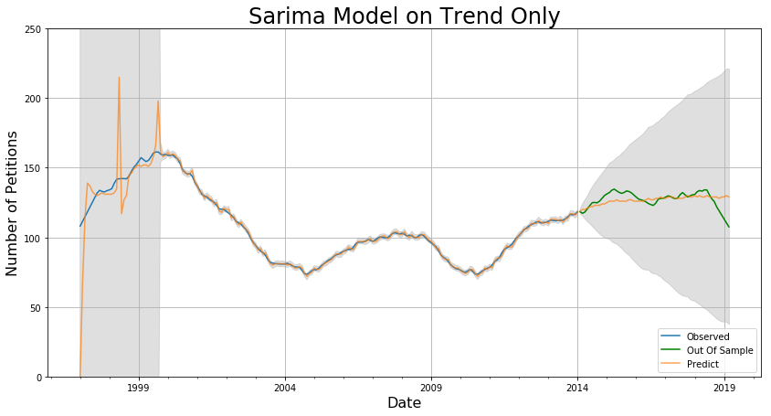
After adding back the seasonality and residuals, we get the following:
The MAE are 7.5 for 3 months, 11.2 for 1 year, 12.5 for 5 years, and a grid-search over p, q, and s shows that this model is as good as it gets for this kind of model. The confidence intervals are now a lot smaller and the chronic lag in predictions seems to be eliminated. This model suffers for short-term predictions because it does not take residuals into account, but it is a better overall predictor in the long term.
Forecasting using Linear Regression
One thing I noticed when doing this project was that the number of rent petitions has a similar trend as the unemployment rate in San Francisco, which is plotted below.
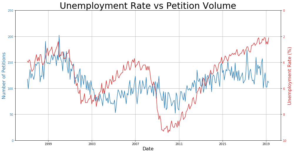
In fact, the trends in the data seem so uncannily similar that I felt there might be a cause-and-effect type scenario here. If that’s true, then it should be theoretically possible to predict to a high-degree of accuracy what the number of petitions is based on the unemployment rate. First, let’s see how much the petitions data lags behind the unemployment rate.
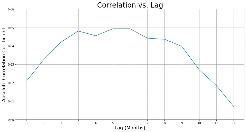
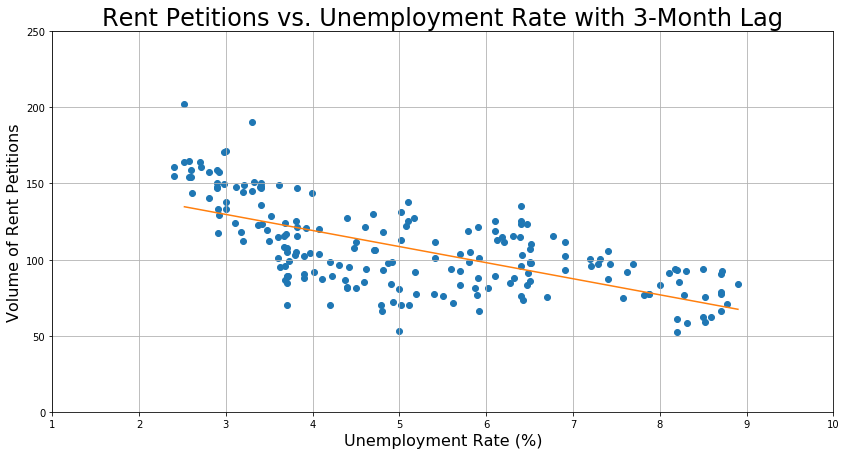
Based on this graph, we should test a 3-month, 5-month, and 6-month lag, because they have the highest correlation coefficients. After testing all three, I found that a 3-month lag was the best predictor. To generate the coefficients for this one-feature one-target model, I used sklearn’s KFold function to make a 5-fold cross-validation loop with an 80-20 split so that I could obtain the training score and validate on the test set.
For linear regression, the R² value is the right metric for evaluating how well the model performs, because when R² is between 0 and 1, it can be interpreted as the fraction of the data that is explained by the model. For example, if R² = 0.30, then my model explains 30% of the variation in my data. The train and test scores are given below.
train_r2_score:  0.3895005050301806  +/-  0.09232391539274709
test_r2_score:  0.3771517602333726
Although the R² value may appear low, the following graph of the model shows that it is actually pretty reasonable.
By using the linear regression to transform the unemployment rate into a predicted number of rent petitions, I obtain the following model.
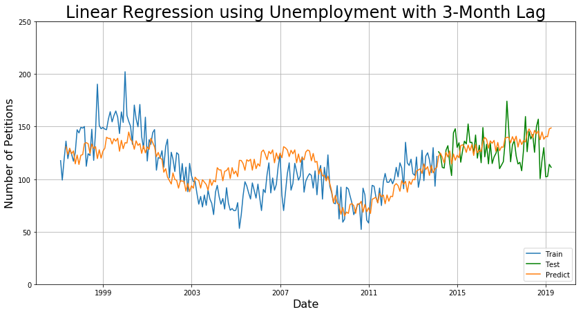
The MAE are 4.1 for 3 months, 10.1 for 1 year, and 13.5 for 5 years. This is nearly as good as the first SARIMA model for short-term prediction and even better for long-term prediction. This would be the preferred model if instantaneous speed is required, because the model takes nearly no time to train.
Results
The following table summarizes the results of the modeling and the advantages of using each approach.
| Model | Benefits | MAE (3 months) |
MAE (1 year) |
MAE (5 years) |
|---|---|---|---|---|
| SARIMA Baseline | Best short-term predictor | 4.9 | 11.4 | 14.8 |
| SARIMA on Trend | Best long-term predictor | 7.5 | 11.2 | 12.5 |
| Linear Regression on Unemployment (3-month lag) | Fastest and most interpretable | 4.1 | 10.1 | 13.5 |
Conclusions
I made three different forecasting models to predict the number of rent petitions in San Francisco, each having their pros and cons. For the most accurate short-term prediction, SARIMA on the trend and residuals works the best. For long-term predictions, SARIMA on trend only works the best. For the fastest data-driven model, if the data is available beforehand, using a predictive feature such as unemployment rate is the best, and this model has the added bonus of being highly interpretable.
The forecasting techniques presented here are invaluable tools in my collection of data science techniques and can generalize to any kind of data involving time-series.
If you’re interested, please check out the github repository here. I hope you enjoyed this tutorial, and happy predicting!