Every year, many graduating students are confronted with the choice of whether to go on to graduate studies. One online tool that is very useful in monitoring graduate school applications is The Grad Cafe, which is an online forum on which users can self-report their grades, GRE scores, subject GRE scores, and comment as to why they got their results.
Since Ph.D. programs and admissions vary by field, it made sense to focus on analyzing one field at a time. I chose physics, since it is relevant to my own background. Using student grades and GRE scores, I wanted to see how accurately machine learning can predict whether or not a student got into a Ph.D. program.
Data Acquisition
The data was scraped by Github user evansjames and freely available here.
Data Cleaning
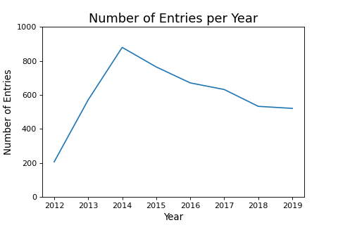
Although downloading the data is easier than scraping it myself, there is still some work I had to do. I cleaned the data by dropping NaNs, filtered out erroneous data, one-hot-encoded some categorical features, converted numbers from string to float type, and selected on Ph.D. admissions only. Furthermore, I chose to analyze applications after 2014, since this seems to be when the number of entries on The Grad Cafe reaches its peak, as seen in the figure below.
Exploratory Data Analysis
To visualize and understand the data that I had, I used the following one-line-wonder from the Seaborn library to generate a pair plot. A pair plot is simply a n-by-n grid, where the diagonals are histograms of the distribution of each variable, and the off-diagonal entries are scatter plots of one variable with another. With the pair plot, I prefer my target to be on the bottom row and right column, and I typically arrange the features in decreasing order of correlation with the target from top to bottom, left to right.
sns.pairplot(physics_df, hue = "Decision")
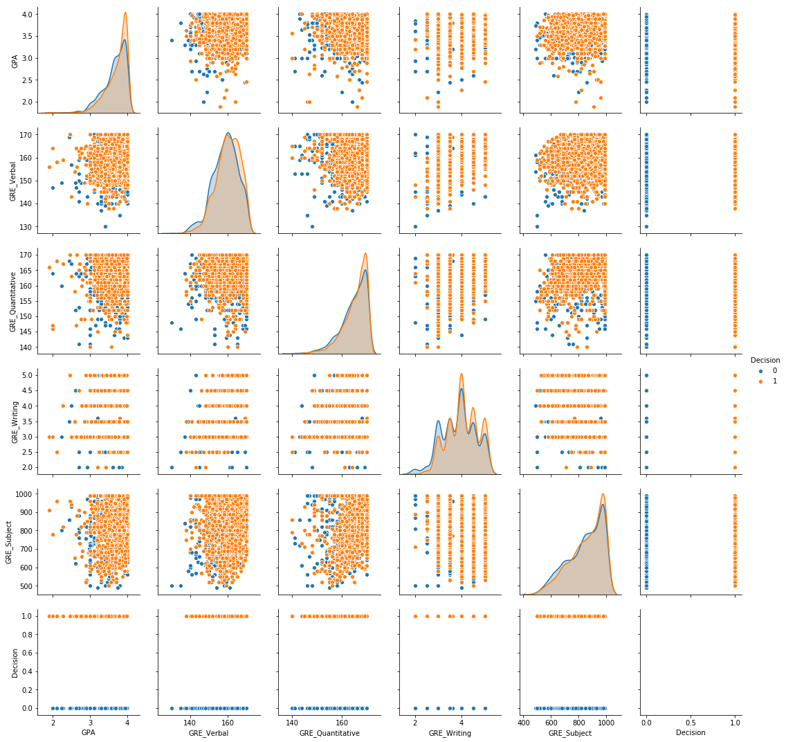
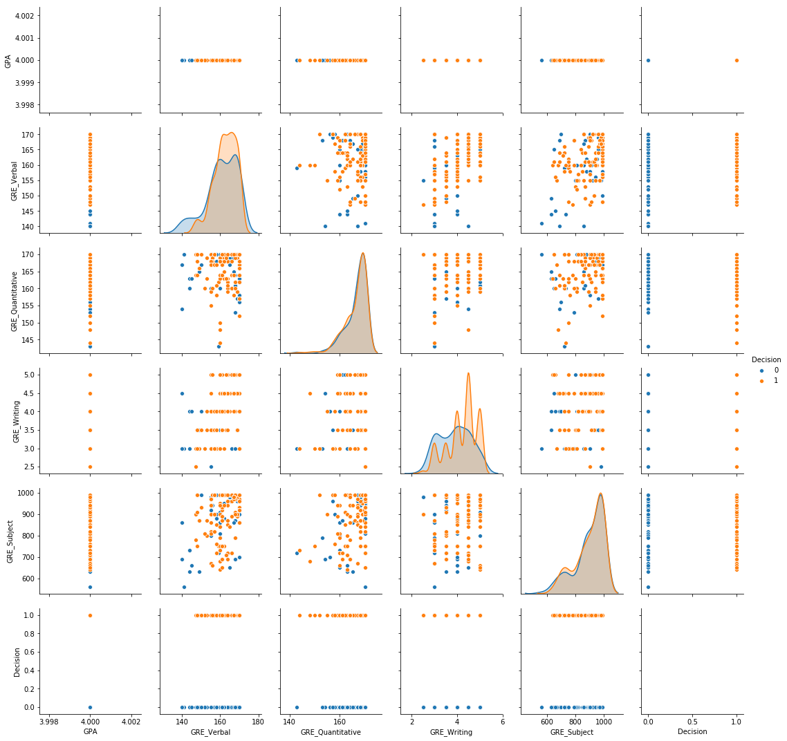
By coloring the hue based on the target, it becomes easy to see that the data is mostly non-separable, meaning that none of the variables by themselves were particularly strong indicators of admission. Since I found this to be interesting, I asked the additional question, “what if a student has perfect scores?” The following three pairplots show the cases for having perfect GPA, perfect subject GRE, and both.
Perfect GPA:
sns.pairplot(physics_df[physics_df['GPA'] == 4.0], hue = "Decision")
Perfect Subject GRE:
sns.pairplot(physics_df[physics_df['GRE_Subject'] == 990], hue = "Decision")
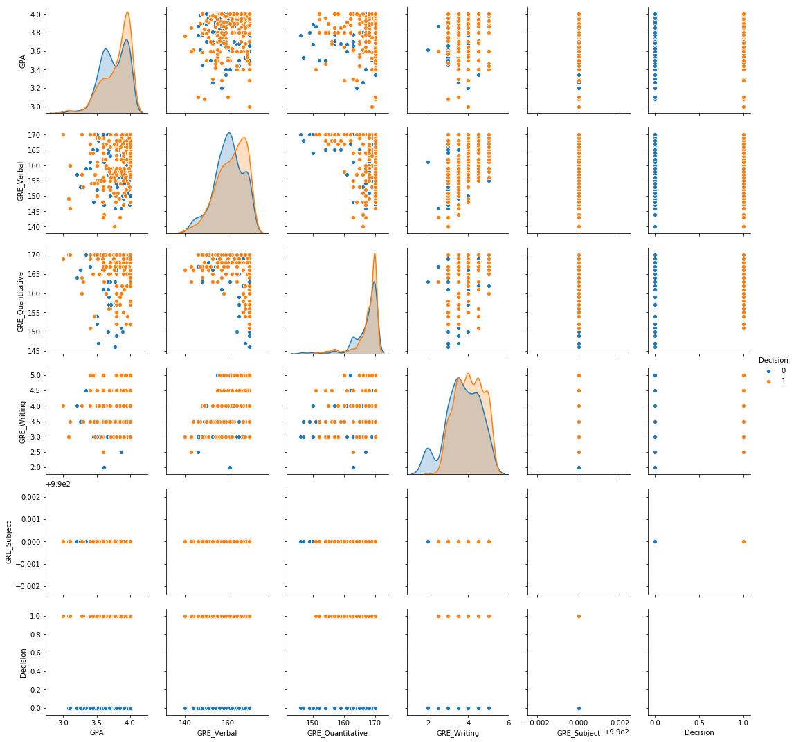
Perfect GPA and Subject GRE:
sns.pairplot(physics_df[physics_df['GPA'] == 4][physics_df['GRE_Subject'] == 990], hue = "Decision")

I personally found it interesting that even with perfect scores, rejection was still a distinct possibility. However, there is now a higher degree of separation between admitted vs. rejected students. This gives hope that for the larger dataset, there is enough separability.
Feature Transforms
Since I was working with relatively small data (~5000 rows), I felt at liberty to add some additional features by transforming the existing ones and adding cross terms to hopefully improve separability. I had to be careful with this process, since it was easy to a cause feature explosion, or a proliferation of excess features with no real benefits. The features I generated were the log, square, conversion of GRE scores to percentiles, and addition of cross terms between GRE scores. This increased the number of features I had from 8 to 26, which also means I had to choose which ones to keep. To test whether these contributed positively to separability, I used simple logistic regression as my baseline model, and through trial-and-error tested whether or not the features improved my classification accuracy.
Feature Selection using Logistic Regression
Logistic regression is a machine learning model that is primarily used for classification. The goal is to predict a binary target, usually 0 or 1. Logistic regression takes numerical and one-hot-encoded inputs and returns a probability for the input is to be classified as class 1. By default, if the probability of being class 1 is greater than 0.5, then logistic regression will classify that entry or row as being class 1. However, it is also an option to tune the threshold to obtain different values of precision and recall depending on the application. For example, for fraud detection, one might want high recall at the cost of having low precision, since the goal is to capture all the fraud cases and not necessarily be certain whether or not the predicted cases of fraud are actually fraud. Keeping these basic concepts in mind, let’s begin modeling.
The first step in any machine-learning process is always to set aside some data that must remain untouched while training the model. Only on testing on an out-of-sample test set is it possible to estimate how well the model can generalize to data it has never seen before.
In adherence to best practices, I used sklearn’s train_test_split function to set aside 20% of the data, then with the remaining 80% of the data, I used sklearn’s KFold function to make a 5-fold cross-validation loop with an 80-20 split. For this particular classification task, I added the additional step of random upsampling within each cross-validation loop so that the classifier is trained on a balanced training set on each loop, giving an unbiased measure of performance.
Let’s see how the classifier performs on the train and test set using two metrics: the ROC AUC score and the F1 score, which measure slightly different things.
train_roc_auc_score:  0.5950657812215517  +/-  0.02046357413259404
test_roc_auc_score =  0.6217940702022033

train_f1_score:  0.5676272425897035  +/-  0.01562108163161059
test_f1_score =  0.581772784019975
The ROC AUC stands for the Receiver Operating Characteristic Area-Under-the-Curve (AUC), and it has a probabilistic interpretation that given a random positive-negative pair that the classifier will classify each correctly. In other words, the ROC AUC says that given a pair of entries from the test set, in which one student was admitted and one was rejected, the classifier will correctly classify them 62% of the time. Better than a coin flip, but not great either.
What about the F1 score? The F1 score is the accuracy score if I set my threshold to balance precision and recall. In other words, if I adjust the threshold higher, then my precision will rise while my recall will fall, and vice versa. Let’s see what this looks like in graphical form.
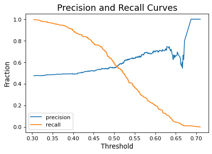
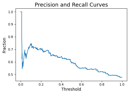
It is also possible to visualize precision and recall in one curve, shown below. As can be seen, increasing one necessarily decreases the other, except at the extremities.
Lastly, the ROC curve plots the false positive rate (FPR) on the x-axis and the true positive rate (TPR) on the y-axis.
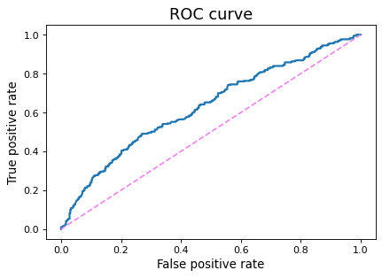
Like the precision-recall curve, the ROC curve is generated by considering all thresholds for each classification. A random guess is represented by a diagonal line, since FPR and TPR are equal on this line. Models that perform better than a random guess are pushed up toward the top left corner, since this is the space in which the TPR is higher than the FPR. The area under this curve is the ROC AUC, as explained above. When plotting multiple ROC curves on the same graph, it becomes very to see immediately which model performs the best.
Through trial and error, I found that the following additional features improved my logistic regression model.
'GPA_sq' # GPA squared
'GRE_Writing_pc' # GRE Writing score converted to percentile
'GREVxGRES' # GRE Verbal multiplied with GRE Subject
By including these three additional features, I managed to squeeze out a small amount of improvement in the ROC AUC.
train_roc_auc_score:  0.599475238280368  +/-  0.019688850571677814
test_roc_auc_score =  0.6297283947529667

train_f1_score:  0.567938767550702  +/-  0.0160023456001789
test_f1_score =  0.5767790262172284
The improvement was extremely slight, but nonetheless an improvement, so I kept these features for my future modeling.
Testing Other Classifiers
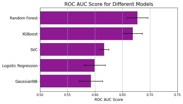
To see if I can do better than Logistic Regression, I compared a number of classifiers, which I enumerate below in order of increasing ROC AUC scores.
| Classifier | Train ROC AUC | Test ROC AUC |
|---|---|---|
| Gaussian Naive Bayes | 0.5926 +/- 0.0215 | 0.6232 |
| Logistic Regression | 0.5995 +/- 0.0197 | 0.6297 |
| Support Vector Machine | 0.6166 +/- 0.008 | 0.6523 |
| XGBoost | 0.6269 +/- 0.014 | 0.6644 |
| Random Forest | 0.6718 +/- 0.0198 | 0.6854 |
As mentioned above, the ROC curve is a great way to see which model performs the best.

As shown here, the curve for Random Forest is higher than all other models for nearly all thresholds, and this becomes even more apparent in the bar chart below. Even at its worst, random forest performs better than the best of the next-best classifier.
About Random Forest
Since random forest was my best model, I want to take some time to explain what it is. The following is a simple decision tree generated by Graphviz that can be used for classification. At each node in the tree, the classifier decides on a threshold and groups the data into two categories. Following the decision tree all the way down to the end is how the model returns a prediction.
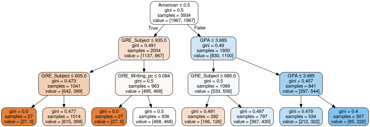
The decision tree above is truncated so that you can see what is going on in each node. For humans, only small decision trees like the one above are interpretable, but for machines, the trees can be arbitrarily large and complex with many nodes and branches, like the one below.

By itself, such a large decision tree is prone to overfitting. However, a random forest is an ensemble of many such trees, and all the overfitting of individual trees is averaged out.
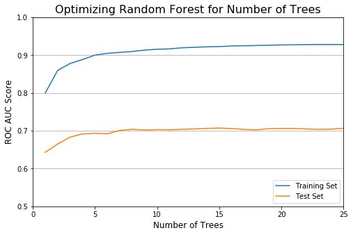
Optimizing Random Forest
To really ensure that my random forest isn’t overfitting the data, I decided to prune it on two hyperparameters: the max depth of each tree, then the number of trees.
Optimizing on the max depth of each tree, we see below that the max depth should be limited at 13, because anything above does not improve the test score, and this is also where the training score begins to plateau off. If access to the test set is not available, it is also possible to pick a cutoff using only the training set by requiring that each increase in depth yields above a threshold of improvement.

After optimizing for max depth, I pruned the number of trees. As expected, this was less significant, but this does improve the training speed. The model plateaus after 8 trees.
With a max depth of 13 and a limit of 8 trees in the ensemble, let’s now see how the model performs.
train_roc_auc_score:  0.6641286096250937  +/-  0.016094033876368447
test_roc_auc_score =  0.7039852943015418

train_f1_score:  0.6138743174726989  +/-  0.01471408576581624
test_f1_score =  0.6441947565543071
This is an improvement upon just using the default options and a significant improvement upon the baseline model of logistic regression.
What does this look like in terms of the actual predictions? One way to visualize the predictions is to generate a confusion matrix, which is a table that shows how many items from each class were correctly classified. Let’s check what it looks like when the precision and recall are balanced at a threshold equal to 0.481.

As can be seen above, 518 out of the 801 entries in the test set were correctly classified. This is a classification accuracy of 0.647, which is equal to the f1-score.
Feature Importance
One important aspect of decision-tree-related algorithms such as random forest is that it’s relatively easy to compute the feature importances. This option ranks the features in terms of their predictive power, from most predictive to least, by calculating, on average, how much each feature decreases the gini coefficient across multiple trees. Although this approach may be prone to error, it can be used to provide some interpretability, as well as a sanity check to see if the classifier is performing as expected.
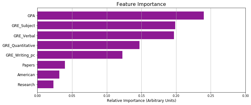
As expected, GPA comes first, followed by GRE Verbal and GRE Subject, which are known in physics to be great predictors of whether one makes it to graduate school. Two features that seemed low were research and papers, but this also makes sense, since these were features derived from the comments section of the dataset, and not everyone who had research or publications necessarily reported on them.
Conclusions
By testing different classifiers, I found that random forest performs the best, with an out-of-sample ROC AUC score of 0.704 compared to the 0.630 of logistic regression. The low score suggests that PhD admissions depends heavily on unavailable data such as letters of recommendations or research experience and provides a strong case for grades not being the major driver of graduate school admissions.
Check out the Github repository here.