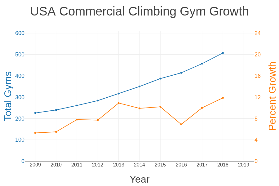
Rock climbing is one of the fastest growing sports in the world. According to the Climbing Business Journal, the establishment of new climbing gyms in the United States is currently in exponential growth, with an estimated 100 new gyms opening between 2018 and 2020 to meet the growing demand of new climbers. With the ever-increasing number of new gym climbers, it is expected that more people will also become interested in outdoor climbing.
Mountain Project is an online directory in which users can search for information on rock climbs at outdoor areas such as Bishop, CA or Joshua Tree. Users can also vote on features such the number of stars, the grade, or add it to their tick-list or to-do-list, much like how on Amazon, you can review items, vote on them, and add them to your shopping cart.
As classic areas and popular rock climbs become saturated with new climbers, experienced climbers may become more interested in rock climbs that are not as well known than trying to compete with the crowd. Therefore, as a data scientist and a rock climber, I wanted to use the classical machine learning technique of regression to predict the number of users who have a rock climb on their to-do-list.
Data Acquisition
Some of the data is freely available for download as a csv file from Mountain Project. However, this is limited to 1000 rows at a time to limit the online traffic, and only a limited number of features are included: the Average Stars, Length, and Grade. Two other features and the target (On-To-Do-List) are only available through the website. Fortunately, the links to the individual pages containing these data are available in the csv file, ensuring that the scraping process will be relatively easy.
To obtain the remaining features, I wrote a simple script using BeautifulSoup with a random time-out so that I didn’t overload the website. I obtained data for rock climbs in the Bishop, CA and Joshua Tree areas, although I later chose to focus on the Bishop dataset, since it is the most popular climbing destination in California.
Exploratory Data Analysis
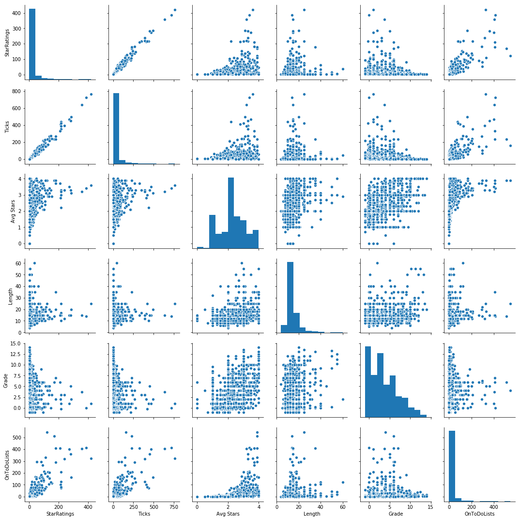
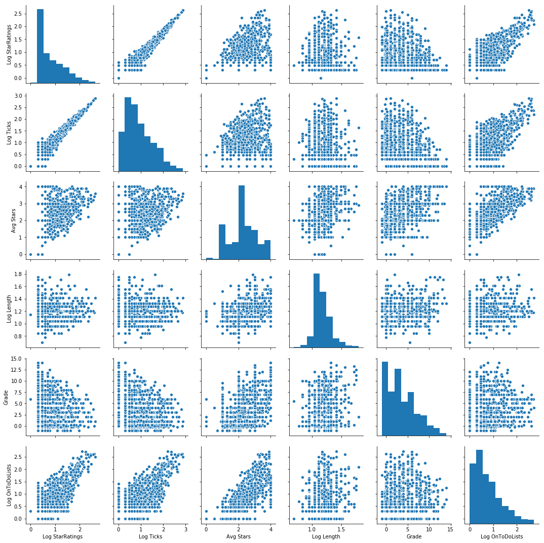
To visualize and understand the data that I had, I used the following one-line-wonder from the Seaborn library to generate a pair plot. A pair plot is simply a n-by-n grid, where the diagonals are histograms of the distribution of each variable, and the off-diagonal entries are scatter plots of one variable with another. With the pair plot, I prefer my target to be on the bottom row and right column, and I typically arrange the features in decreasing order of correlation with the target from top to bottom, left to right.
Generating a pair plot enables me to see how the features relate to each other and determine whether or not I needed to transform any of them for the final modeling. From the pairplot, it is apparent that Avg Stars, Length, and Grade have a non-linear relationship with the target, indicating that transformations are needed for these features in particular.
sns.pairplot(bishop_df[features_target_list])
I also generated a heat map to check for co-linearity.
# Plot heatmap for baseline case.
plot_heat_map(bishop_df.loc[:,['StarRatings', 'Ticks', 'Avg Stars', 'Length', 'Grade', 'OnToDoLists']])
ax.set_title('Correlation Heatmap for True Baseline Case', fontsize = 18)
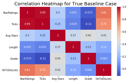
From both the pairplot and the heatmap, it is evident that StarRatings and Ticks are collinear. However, though trial-and-error, I found that keeping both features does, in fact, improve the model. If speed is valued over performance, then Ticks can be removed from the set of features.
Initial Linear Regression
I built an initial model based on the untransformed variables to obtain a measure of baseline performance. Any subsequent model I build must improve upon this or else be discarded.
In adherence to best practices, I used sklearn’s train_test_split function to set aside 20% of the data, which must remain untouched while training the model. Testing the model on this out-of-sample test set will provide a reasonable estimate for how well the model generalizes to other out-of-sample data.
Of the remaining 80% of the data, I used sklearn’s KFold function to make a 5-fold cross-validation loop with an 80-20 split. In other words, this function partitions the data five times, enabling me to train on 80% (64% of my total data) and validate on the remaining 20% (16% of my total data). KFold splits the data in such a way that none of the 20% in each validation set overlaps with the next, allowing equal representation of all data points.
After training and validating on each fold, I can obtain a score to measure how well my model performs on in-sample data, or the R² validation score, which I will explain below. Finally, I trained on the entire 80% of the data and tested on the first 20% I set aside to obtain the R² test score for out-of-sample data.
Measuring Model Performance
The R² value is a good metric for regression problems, because it is a measure of how well my model captures the variance of my data. It is defined by the following formula:
R² = 1 - SSE/SST
SSE (Sum of Squares Error) is a measure of how far my predictions deviate from the observed data, and SST (Sum of Squares Total) is a measure of how much the data deviates from the mean. A perfect model (or perfect data) has an R² of 1, while a model that is completely erroneous could have a negative R². When R² is between 0 and 1, it can be interpreted as the fraction of the data that is explained by the model. For example, if R² = 0.65, then my model explains 65% of the variation in my data.
Doing cross-validation is a good way to ensure that my validation score is not arbitrarily high or low simply because of the way the data was split. For this task, I chose to use both sklearn’s LinearRegression function and Statsmodel’s OLS, just to compare the two libraries. I found that I prefer Statsmodels over sklearn for regression problems, because alongside the main model, it also provides other statistics that give a wider picture of model performance. As expected, the models from both libraries gave the same scores.
# Sklearn's Linear Regression
val_r2_score:  0.7850858488678168  +/-  0.06682093878949044
test_r2_score:  0.6426057149839702
# Statsmodels OLS
val_r2_score:  0.7850858488678172  +/-  0.06682093878949083
test_r2_score:  0.642605714983973
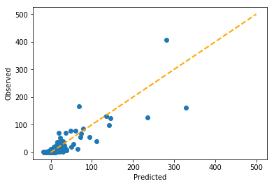
As you can see from the score, the validation score shows that the model explains 78.5% of the variance for in-sample data, but the test score shows that when generalizing the model to out-of-sample data, the model only explains 64.3% of the variance.
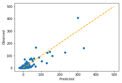
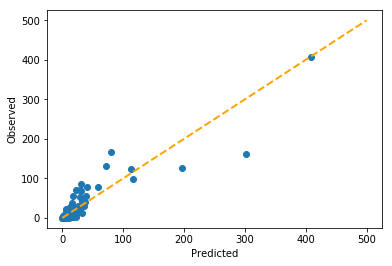
To see what this looks like, I plotted a graph of predicted vs. observed. In a perfect model, all the data points would align with the diagonal line, but as you can see, some of the data points do not fall perfectly on the line. Nonetheless, the model seems to be performing reasonably well.
Regularization
One of the reasons that the model performance dropped so dramatically for out-of-sample data is that the model was pulled away from the best fit by data points that deviate a lot from the model. This is known as overfitting. For count data, this is usually driven by heteroscedasticity, or the tendency for the data to diverge as the counts increase.
To rein in the effects of heteroscedasticity, one effective technique is to use a process called regularization, which adds a penalty for data points that deviate far away from model. The two main forms of regularization for linear regression are Ridge and Lasso. The only difference is the penalty term. For Ridge, the penalty term is an L2 norm, and for Lasso, it is an L1 norm. Using regularization introduces a hyperparameter called alpha, the coefficient representing the size of the penalty. In order to effectively use the regularization, a data scientist must first grid-search across many different alphas in order to find the one that achieves the lowest error. Let’s see what this process looks like.
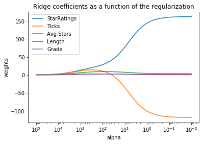
Ridge
With the graph below, it is possible to see how the weights of the linear regression model changes with regularization. As alpha approaches 0 (the right side of the graph), the weights should equal those of the linear regression, while as alpha approaches infinity (the left side of the graph), the weights shrink to zero. (Note: The x-axis is reversed; this is the convention in data science.)
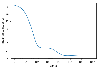
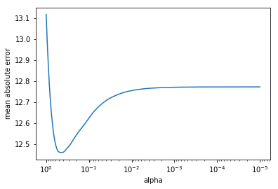
To find which value of alpha gives the best score, I plotted a graph of mean absolute error vs. alpha. With Ridge regression, the minimum in mean absolute error occurs at alpha = 1.6032453906900417.
Let’s see how well this new model fits the data.
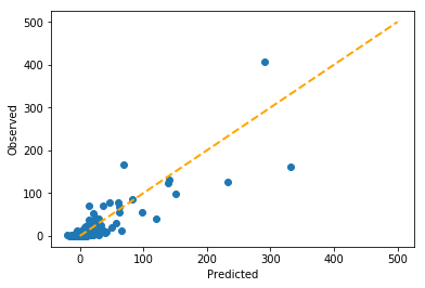
The predictions are doing slightly better on the lower end of the scale.
# Ridge Regression
val_r2_score:  0.7858573765842731  +/-  0.07982620811892865
test_r2_score:  0.6582658734198588
Lasso
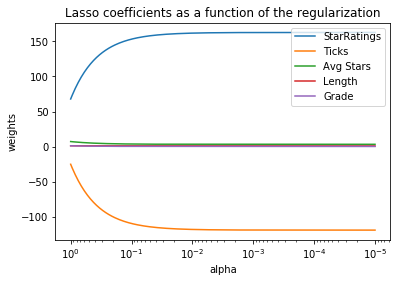
With the graph below, it is possible to see how the weights of the linear regression model changes with regularization. The results are similar to those of ridge regression, but the coefficients change in a dramatically different way.
To find which value of alpha gives the best score, I plotted a graph of mean absolute error vs. alpha. With Lasso regression, the minimum in mean absolute error occurs at alpha = 0.4466835921509635.
Finally, let’s see how well Lasso performs on the data.
Again, similar to ridge, but with subtle differences.
# Lasso Regression
val_r2_score:  0.7793544974177732  +/-  0.08857185765375235
test_r2_score:  0.6646699046091014
Elastic Net
Finally, sklearn and statsmodels both give the option to combine lasso and ridge regularization in a function called ElasticNet. This is a form of ensembling akin to using a weighted average, in this case, with Lasso and Ridge. The default is 0.5 Lasso and 0.5 Ridge.
# Elastic Net
val_r2_score:  0.6639501222790114  +/-  0.11426656017757011
test_r2_score:  0.6593465705847542
Here, the in-sample validation score more closely resembles the out-of-sample test score, indicating that the data is no longer overfit.
Log Linear Regression
Because the above pairplot shows that not all features are linearly related to the target, it is advantageous to transform the data using the log and square root transforms to linearize the features with respect to the target. After some trial-and-error in testing different combinations of features and targets, here’s the pairplot for the combination that gave the highest R² score in linear regression.
Due to the linearization, this model performs much better than regression on the untransformed variables.
# Log-Linear Regression
val_r2_score:  0.7193316142014793  +/-  0.1004154565123687
test_r2_score:  0.7713159789396038
In fact, the test score is higher than the validation score, suggesting that the model generalizes well to out-of-sample data. Let’s see what this looks like in terms of predicted vs. observed.
From the graph, it would appear that the regresssion is performing especially well on data in the lower left corner.
Poisson Regression
The last tool in the bag is Poisson regression, which is essentially a log-linear regression, much like the one used above, but uses a different minimization procedure from ordinary least squares. Unlike in linear regression, which is heavily affected by the heteroscedasticity, the minimization procedure for Poisson regression anticipates the heteroscedasticity and adjusts the penalty accordingly, arriving at different coefficients. Let’s see its performance.
# Poisson Regression
val_r2_score:  0.8067126232705204  +/-  0.0936183695150618
test_r2_score:  0.8212121466062641
This is by far the best model. Both the in-sample cross-validation score and the out-of-sample test score are extremely high.
Furthermore, this model performs well for data points toward the upper right side, far away from the origin.
Ensembling Log-Linear and Poisson Regression
The central theme throughout this entire process is the following: “Can we do better?” As it turns out, we can. As can be seen in the figures above, log-linear regression performs well for lower counts, and Poisson regression perfoms well for higher counts. What if we can combine them in such a way to obtain the best of both worlds?
The process of combining multiple machine learning models is called ensembling. Similar to how ElasticNet is an ensemble of Ridge and Lasso regression, let’s ensemble log-linear and Poisson regression to make a better model. The hyperparameter in this case is the ratio of log-linear to Poisson regression.
Grid-searching across different combinations of Log-Linear and Lasso regression, I found that 0.76 log-linear regression combined with 0.24 Poisson regression gives the highest cross-validation score.
# Ensemble of 0.76 log-linear and 0.24 Poisson regression
val_r2_score:  0.7443756283032941  +/-  0.08159091648379424
test_r2_score:  0.8420211467188347
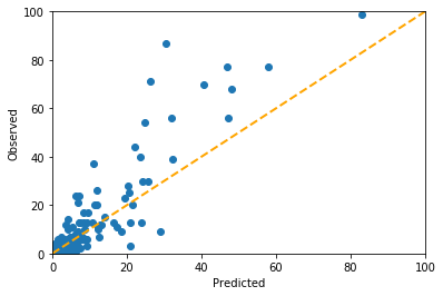
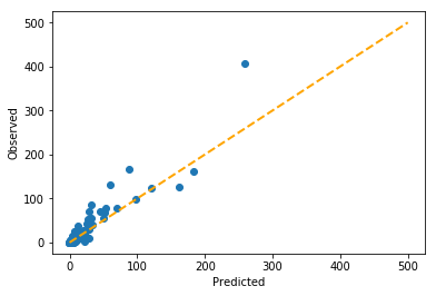
The out-of-sample R² score is even higher than just the Poisson regression alone, and you can see the predicted vs. observed are visibly closer to the diagonal than in any of the previous models.
Results Summary
| Regression Type | Cross-validation R² Score | Test R² Score |
|---|---|---|
| Ordinary Least Squares | 0.7851 +/- 0.0668 | 0.6426 |
| Ridge | 0.7859 +/- 0.0798 | 0.6583 |
| Lasso | 0.7794 +/- 0.0886 | 0.6647 |
| Elastic Net | 0.6640 +/- 0.1143 | 0.6593 |
| Log-Linear | 0.7193 +/- 0.1004 | 0.7713 |
| Poisson | 0.8067 +/- 0.0936 | 0.8212 |
| Log-Linear Poisson Ensemble | 0.7444 +/- 0.0816 | 0.8420 |
Conclusion
I made an accurate predictor of whether a particular rock climb will be on someone’s to-do-list based on just five features: the Star Ratings, Ticks, Average Stars, Length, and Grade. My final model is an optimized weighted ensemble of Poisson and log-linear regression, which improved the out-of-sample test score (R²) to 0.842 from 0.643 of the baseline linear regression model.
Using this model, it is possible to compare the model predictions to the observed number of people who have a rock climb on their to-do-list, and in cases which the model predicts much higher than the observed count, recommend that climbers put them on their to-do-list. This will decrease the traffic on the more popular rock climbs and hopefully improve the experience of climbers who choose to climb outdoors.
For those who are interested, please check out the Github repository. Thank you for reading, happy climbing, and I hope you learned something cool about machine learning along the way!